
|
Welcome to the Nektar Project ForumFight Spam! Click Here! |
A nice review |
Post Reply 
|
Page 12> |
| Author | |
Wayne 
Moderator 

Nektar Blues Joined: Jan/01/2007 Status: Offline Points: 281 |
 Post Options Post Options
") Thanks(0) Thanks(0)
 Quote Reply Quote Reply
 Topic: A nice review Topic: A nice reviewPosted: Mar/21/2012 at 08:18 |
|
I found at nice review about the albums last night over at "Welcome to the 70's" and thought y'all would like to read about it.
http://www.welcometothe70s.com/prog3.html |
|
 |
|
|
MickBee
Moderator

Joined: Oct/25/2010 Location: Pocono SummitPA Status: Offline Points: 429 |
Post Options
Thanks(0)
Quote Reply
Posted: Mar/21/2012 at 18:21 |
|
Thanks for finding that Wayne,
A refreshing and unique approach to reviewing many albums he obviously loved from the heart.
|
|
|
|
|
jerry1970
Member

Joined: Mar/24/2011 Location: Netherlands Status: Offline Points: 149 |
Post Options
Thanks(0)
Quote Reply
Posted: Mar/22/2012 at 01:47 |
|
Nice! I hope he expands the Omega section... He only mentions the English albums, while their Hungarian albums are better. And there are a lot more of them!
They still play anniversary gigs every year or so. With the first version of the band founded in 1959, that makes Omega older than The Rolling Stones and even Dutch band Golden Earring. Omega did a few albums for Bellaphon as well. Did Nektar and Omega ever meet? |
|
|
|
|
Lance
Member
Joined: Nov/01/2010 Status: Offline Points: 56 |
Post Options
Thanks(0)
Quote Reply
Posted: Mar/22/2012 at 03:11 |
|
Great piece of writing and an interesting site, will go back to that one.
regards
Lance
|
|
|
Lance
|
|
|
|
|
MickBee
Moderator
Joined: Oct/25/2010 Location: Pocono SummitPA Status: Offline Points: 429 |
Post Options
Thanks(0)
Quote Reply
Posted: Mar/22/2012 at 08:49 |
|
Never actually met Omega Jerry, but their 1975 Bellaphon album "Hall of Floaters in the Sky" did use the Holli Holitzka painting that was first considered for our cover art on Recycled.
 http://www.thenektarproject.com/pictures/posters/posters1975.aspx http://www.thenektarproject.com/pictures/posters/posters1975.aspx
I always used slides taken from that painting as a backdrop during live performances of Recycled side one.
(Fly across the concrete jungle high in the clouds, Looking up to crystal mountains so proud. AND
Imagine you're the prince of eagles tears in your eyes, Do you see there's not much time before we go down down… etc.) Holli began putting brush to canvas on that painting while we were composing and rehearsing Recycled right across the street from his studio in Wembach, Germany. |
|
|
|
|
jerry1970
Member
Joined: Mar/24/2011 Location: Netherlands Status: Offline Points: 149 |
Post Options
Thanks(0)
Quote Reply
Posted: Mar/22/2012 at 09:17 |
|
Great story, Mick! :)
What changed your minds to not use his painting? I love the artwork that ended up being on the Recycled cover, by the way! |
|
|
|
|
MickBee
Moderator
Joined: Oct/25/2010 Location: Pocono SummitPA Status: Offline Points: 429 |
Post Options
Thanks(0)
Quote Reply
Posted: Mar/22/2012 at 12:31 |
|
Well Jerry,
Helmut Wenske was still the official "Bellaphon/Nektar cover artist" when Holli created his Eagle. Holli also had the secondary purpose of maybe being granted Wenskes' position to do our Recycled cover when he began the artwork... however, Wenske was given the task anyway, and you've already stated the obvious, we loved Wenskes' cover art too.
As Bellaphon already had Holitzkas' eagle artwork on file... they offered it to Omega instead.
As a side note... In 1976, I replaced the cover of MY personal vinyl copy of Recycled with the Floaters cover, printed "Recycled" down the swordblade and borrowed the RTF Nektar logo to cover the Omega name.... just to see how it might have looked.
I still have my vinyl Recycled album in that same cover and an original Holitzka print is on my wall. 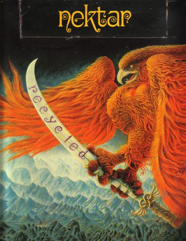 |
|
|
|
|
jerry1970
Member
Joined: Mar/24/2011 Location: Netherlands Status: Offline Points: 149 |
Post Options
Thanks(0)
Quote Reply
Posted: Mar/22/2012 at 18:06 |
|
Nice, but I preferthe official one! ;)
This reminds me - I tried to find the font names that were used for the band name and titles of albums. I only know Roundhouse is Arnold Böcklin. Maybe this should be in another thread? |
|
|
|
|
MickBee
Moderator
Joined: Oct/25/2010 Location: Pocono SummitPA Status: Offline Points: 429 |
Post Options
Thanks(0)
Quote Reply
Posted: Mar/23/2012 at 17:06 |
|
If anyone is into it, I too would be interested in all the various font names too, as each was different.
My favorite was the distinct font used on RTF.
Which leads to another quick story....
I copied single tracks from our best live performances of the seventies to compile 10 live double CDR copies of the proposed sequence of the Nearfest 2002 set list, months before the actual event (for myself and the band to fully rehearse the set-list in real live times independently).
I needed a cover, but ended up using the Gismonda font (MiaC), as I too couldn't find any of our older Nektar fonts (i.e, RTF, Tab or SLT).
BTW, the reunion set and song/medley times were VERY close to my CDRs, plus the idea of creating unique sets from different seventies live recordings led to my "Door to the Future" release in 2005.
|
|
|
|
|
jerry1970
Member
Joined: Mar/24/2011 Location: Netherlands Status: Offline Points: 149 |
Post Options
Thanks(0)
Quote Reply
Posted: Mar/23/2012 at 17:58 |
|
I'd be interested to get a list of font names...
JTTCOTE has two fonts. I think Tab was drawn, not a design font. The back has a certain typeface, though. Sounds has two fonts. I think I've seen a font looking like the one used on RTF but with less swirls. Roundhouse is Arnold Böcklin. DTE's band logo has a slightly different font than on Sounds. Recycled was probably also drawn, I wish there was a font for that, I love it. Ooh, I once knew what font LiveNY had, but I forgot... Magic should be easy to find... |
|
|
|
|
Post Reply
|
Page 12> |
 Tweet
Tweet
|
| Forum Jump | Forum Permissions You cannot post new topics in this forum You cannot reply to topics in this forum You cannot delete your posts in this forum You cannot edit your posts in this forum You cannot create polls in this forum You cannot vote in polls in this forum |


 Topic Options